Introduction
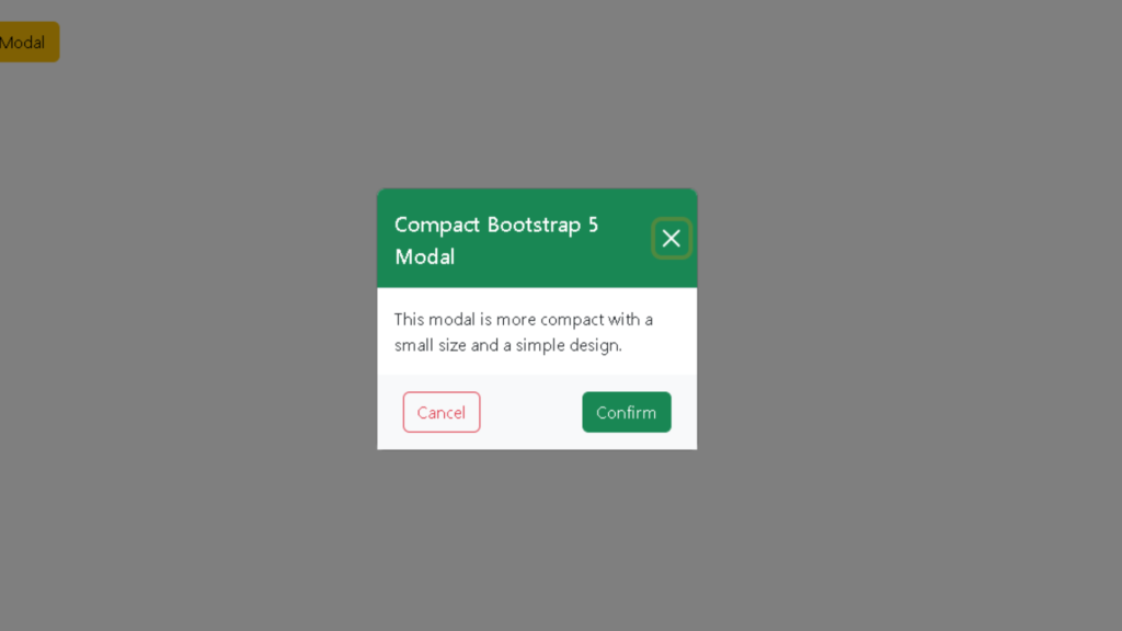
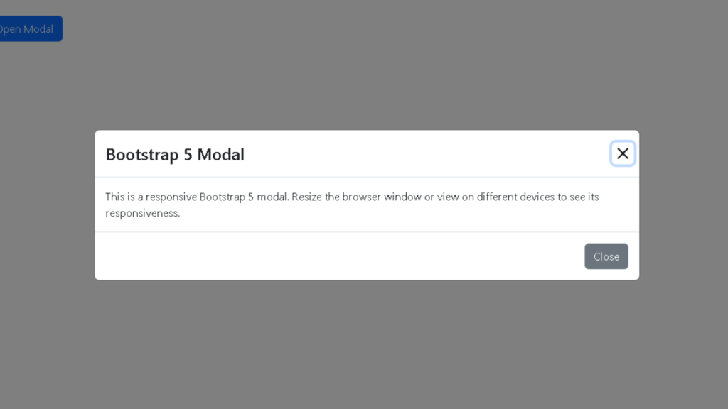
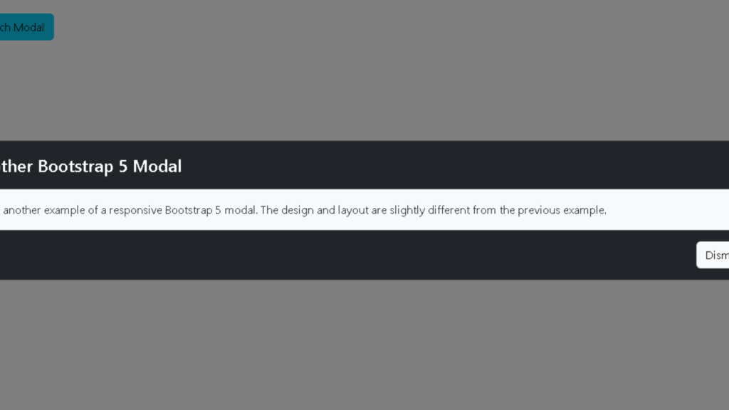
Today we will learn about How To Create responsive Bootstrap 5 Compact modal Login Form.

HTML STRUCTURE
<!DOCTYPE html>
<html lang="en">

<head>
    <meta charset="UTF-8">
    <meta name="viewport" content="width=device-width, initial-scale=1.0">
    <title>Bootstrap 5 Modal - Example 3</title>

<link href="https://cdn.jsdelivr.net/npm/bootstrap@5.2.0/dist/css/bootstrap.min.css" rel="stylesheet">
</head>

<body>

<div class="container mt-5">
        <button type="button" class="btn btn-warning" data-bs-toggle="modal" data-bs-target="#myModal3">
            Show Modal
        </button>
    </div>

<div class="modal fade" id="myModal3">
        <div class="modal-dialog modal-dialog-centered modal-sm">
            <div class="modal-content">

<div class="modal-header bg-success text-white">
                    <h5 class="modal-title">Compact Bootstrap 5 Modal</h5>
                    <button type="button" class="btn-close btn-close-white" data-bs-dismiss="modal"></button>
                </div>

<div class="modal-body">
                    This modal is more compact with a small size and a simple design.
                </div>

<div class="d-flex justify-content-between px-4 py-3 bg-light">
                    <button type="button" class="btn btn-outline-danger" data-bs-dismiss="modal">Cancel</button>
                    <button type="button" class="btn btn-success" data-bs-dismiss="modal">Confirm</button>
                </div>

            </div>
        </div>
    </div>

</body>

</html>
CSS STRUCTURE
<style>
        .btn-close-white {
            filter: invert(1);
        }
    </style>
JAVASCRIPT AND JQUERY
<script src="https://cdn.jsdelivr.net/npm/bootstrap@5.2.0/dist/js/bootstrap.bundle.min.js"></script>CODE INCLUDE
This Login Form code includes the mentioned things
- HTML Code
- JavaScript Code
- CSS Code
Compact LOGIN FORM FEATURES
- Desktop View is Perfect
- Mobile View is Perfect
- Include Bootstrap CDN Library
- Live Webpage Preview Button
How To Create responsive Bootstrap 5 Login Form. Manglastubh By Ankit Akolkar. Search on Google Free Online Courses.

Welcome to Manglastubh By Ankit Akolkar. Manglastubh website is designed and developed for all kinds of Knowledge-Based Blogs and Articles. Everyone will gain knowledge over here from this website.


