Introduction
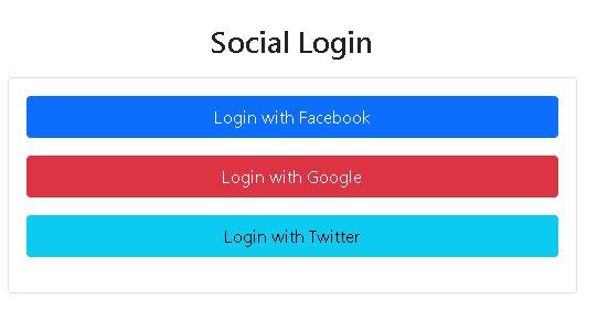
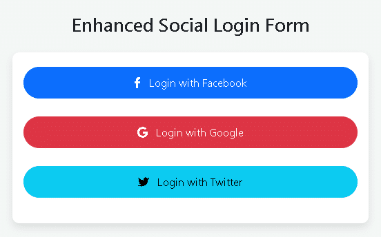
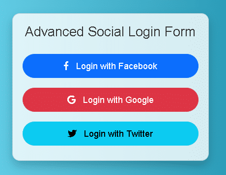
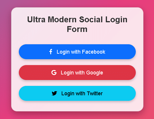
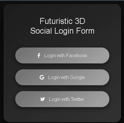
Today we will learn about How to create futuristic 3D social login form.
HTML STRUCTURE
<!DOCTYPE html>
<html lang="en">
<head>
    <meta charset="UTF-8">
    <meta name="viewport" content="width=device-width, initial-scale=1.0">
    <title>Futuristic 3D Social Login Form</title>

</head>
<body>

    <div class="login-container">
        <div class="login-card">
            <h2>Futuristic 3D <br>Social Login Form</h2>
            <button type="button" class="btn btn-primary">
                <i class="fab fa-facebook-f"></i> Login with Facebook
            </button>
            <button type="button" class="btn btn-danger">
                <i class="fab fa-google"></i> Login with Google
            </button>
            <button type="button" class="btn btn-info">
                <i class="fab fa-twitter"></i> Login with Twitter
            </button>
        </div>
    </div>

</body>
</html>
CSS STRUCTURE
    <link href="https://cdn.jsdelivr.net/npm/bootstrap@5.1.3/dist/css/bootstrap.min.css" rel="stylesheet">

    <link href="https://cdnjs.cloudflare.com/ajax/libs/font-awesome/5.15.3/css/all.min.css" rel="stylesheet">

    <style>
        body, html {
            height: 100%;
            margin: 0;
            font-family: 'Arial', sans-serif;
            background: #0f0f0f;
            display: flex;
            justify-content: center;
            align-items: center;
        }
        .login-container {
            perspective: 1000px;
        }
        .login-card {
            width: 400px;
            height: 400px;
            background: linear-gradient(145deg, #1c1c1c, #323232);
            border-radius: 20px;
            box-shadow: 0 20px 40px rgba(0,0,0,0.8);
            transform-style: preserve-3d;
            transition: transform 0.5s;
            display: flex;
            flex-direction: column;
            justify-content: center;
            align-items: center;
        }
        .login-card:hover {
            transform: rotateX(15deg) rotateY(15deg);
        }
        h2 {
            color: #fff;
            text-align: center;
            margin-bottom: 30px;
        }
        .btn {
            background: linear-gradient(145deg, #6e6e6e, #a8a8a8);
            font-size: 16px;
            border-radius: 30px;
            padding: 15px 30px;
            margin: 10px;
            border: none;
            box-shadow: 0 5px 15px rgba(0,0,0,0.5);
            color: #fff;
            transition: all 0.3s ease-in-out;
            width: 80%;
        }
        .btn:hover {
            background: linear-gradient(145deg, #a8a8a8, #d4d4d4);
            box-shadow: 0 10px 20px rgba(0,0,0,0.6);
            transform: translateY(-3px);
        }
        .btn i {
            margin-right: 10px;
        }
        @keyframes bgAnimation {
            0% { background-position: 0% 50%; }
            50% { background-position: 100% 50%; }
            100% { background-position: 0% 50%; }
        }
    </style>
JAVASCRIPT AND JQUERY
<script src="https://cdn.jsdelivr.net/npm/bootstrap@5.1.3/dist/js/bootstrap.bundle.min.js"></script>
CODE INCLUDE
This Login Form code includes the mentioned things
- HTML Code
- CSS Code
- JavaScript Code
futuristic 3D SOCIAL LOGIN FORM FEATURES
- Desktop View is Perfect
- Mobile View is Perfect
- Include Bootstrap CDN Library
- Live Webpage Preview Button
How To Create futuristic 3D Social Login Form. Manglastubh By Ankit Akolkar. Search on Google Free Online Courses.
Welcome to Manglastubh By Ankit Akolkar. Manglastubh website is designed and developed for all kinds of Knowledge-Based Blogs and Articles. Everyone will gain knowledge over here from this website.